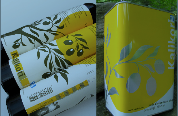
Cover Artist Susan Scott

Un texte de Sarah Cobb
Paru dans le numéro Hiver/Winter 2019
Publié le : 4 Décembre 2019
Dernière mise à jour : 3 novembre 2020
Susan Scott began her studies in Graphic Design at the Central School of Art and Design in London, England and was recruited at her graduate show to join Crosby, Fletcher, Forbes (now Pentagram). She began her Canadian career as a book designer for McClelland & Stewart in Toronto before moving to Montreal where she continued…
Susan Scott began her studies in Graphic Design at the Central School of Art and Design in London, England and was recruited at her graduate show to join Crosby, Fletcher, Forbes (now Pentagram). She began her Canadian career as a book designer for McClelland & Stewart in Toronto before moving to Montreal where she continued at Gottschalk + Ash as a designer and illustrator for clients like the Montreal Museum of Fine Art, Parks Canada and the Caisse de dépôt et placements du Québec.
In addition to her design work, Susan Scott helped shape the graphic design program at Dawson where she continues to teach editorial illustration, shifting in 2009 to part-time to establish www.design514.com and to focus on book design and creating stamps for Canada Post. She has sat on a number of design juries, won a number of design awards and has been published in Grafika, Applied Arts and Graphis.
Susan Scott’s artwork juxtaposes delicate illustrations with bright swaths of colour. Transparent layers of photos, drawings and typography, her work has a timeless quality. Perhaps because she sometimes brings historical events to life in her practice. Her process moves fluidly from computer to paper and back again, often informed by in-depth research into the subject. She is happiest with a client and a clear mandate and gladly collaborates with other designers, drawing inspiration from myriad sources, including her students. In her more whimsical work, she brings puns to life. Her series of cards Food+Thought is as funny as it is beautiful and will appeal to any word nerd with an aesthetic sensibility.
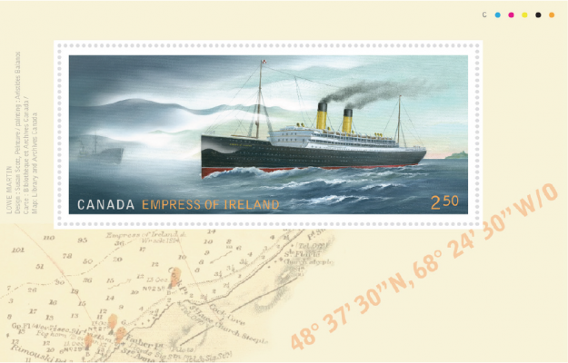
Empress of Ireland. A commemorative postage stamp and souvenir sheet issued by Canada Post in 2017. A collaboration with Aristides Balanos, marine painter.
I first met Susan when she chose us to work on the house she’d recently relocated to in Stanbridge East. A lovely, rambling stone house with thick walls and excellent bones but in need of some love. While most of our clients have trouble selecting paint colours for their rooms, the artists we work for tend to keep a more neutral palette but they also struggle. For them, it’s weighing the qualities of a hundred whites. For Susan, it was also about the lines. One got the sense that her discerning eye would literally trip on an imperfection most wouldn’t even notice. Her attention to the smallest detail gave us the freedom to do some of our best work
Once she’d had her way with the house, the result was gorgeous. A riot of colour set against a sober backdrop. Banisters and furniture layered in bright, textured fabrics & rugs. Objects like cans of olive oil and old typeface numerals lovingly placed around the house — a reminder that every single product we purchase is designed by someone like her.
Her studio is like a Pantone catalogue. Tidy spaces and crisp, white shelves where her work and the inspiring work of others is on display. Brushes and pencils laid out in rows, fine papers and clean surfaces. It is satisfying in the way a well-designed page is, where the white space serves to heighten the effect of the images. The many-paned windows of the corner room frame an ancient, gnarled maple and, when winter sets in, the leaded glass sparkles with delicate curlicues of frost. I have never coveted a space quite like I covet her studio.
Susan Scott is soft-spoken and her words tend to come out in a breathless rush. She is gentle until some aesthetic quandary arises at which point her position becomes as bold as her colour choices. Our team ran roughshod over her house. She responded by plying us with perfect cups of comforting tea from her seemingly bottomless pot. She has created the kind of welcoming home where the kettle is always on. If you are ever lucky enough to be invited for dinner, sitting down to a meal in her kitchen, the food (however delicious) is almost inconsequential as the table itself is a feast for the eyes. Setting a perfect table is an often-overlooked art that so enhances the experience of a meal; a fact not overlooked by Susan, who can’t help but make things as beautiful as she can.
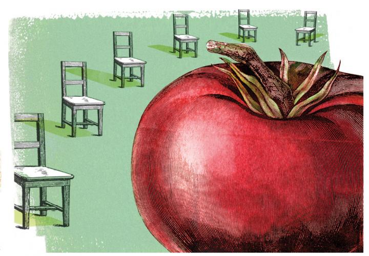
Grilled tomato. An illustration from Food+Thought: A little silliness about food, which was published in 2019 by Aglish Books.
Susan’s book of illustrations, Food+Thought, is for sale at l’Atelier Bouffe, Fraîche and at Brome Lake Books. If you have a small business and need help branding or creating the look for your products or visual media, drop her a line at sscott@design514.com. In case you’re looking for inspiration, go pay her a visit at her studio. If you’re lucky, the kettle will be on.
